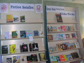

We also took some short A-Frames from the garage, added casters (thanks, Papa!), and are using them to display our Cooking, Art, and a portion of the History section; cases that often got overlooked, and do much better with beautiful covers fronted out. Those A-Frames are movable so that we can host more events inthe Main room of the store (and hopefully get more people to come!). There are also some more table displays in the Main Room, so I can have fun with displaying book themes still :)


We also moved the card rack to the front counter area, for last minute gifty sales.

And we cleared out clearance. We'll have just 2 carts now of clearance and not a long wall... now that we're more "high end" .
Aaron's Books, you rock! We loved the new indie promo stuff too. We'll have to visit if we're in town. Margie at The Bookstore in Glen Ellyn, IL: www.justthebookstore.blogspot.com
ReplyDeleteI am going to make it out to your store one day, love the new look!!!! :)
ReplyDeleteI love your ideas, and your enthusiasm! I hope I get to visit the store in person some day. It looks like such a warm and welcoming place. Wishing you lots of support from your community as you make these changes!
ReplyDeletewow, i want to won a bookstore now:)
ReplyDelete-amy